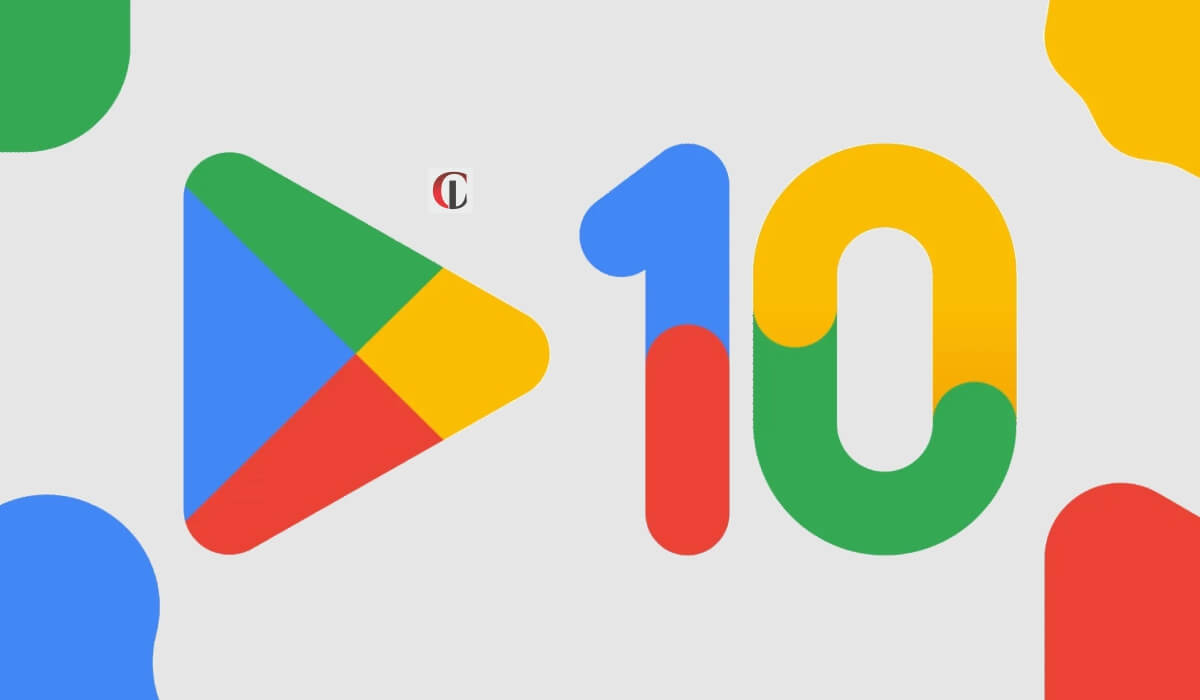
Google Play is marking its tenth-year existence in digital distribution services and celebrating its tenth anniversary with a brand new and revised logo. It has received a revamp and tweaking logo’s overall shape.
The changed logo uses less vibrant colours that closely match the green, yellow, blue, and red hues that Google has been operating for its various services.
The revamping seems to be a subtle adjustment that aggregates the new Google Chrome logo, which was updated earlier in the current year.
Google Play additionally shared on Twitter that “this year marks our tenth year of Google Play-ing. We are offering Play Points members 10x booster points to celebrate it, starting from today.
Stating further about Google Play, Tian Lim, the VP of Google Play, noted, “we are launching a new logo which will reflect the magic of Google and matches the branding shared by various of their helpful products like Search, Assistant, Photos, Gmail, and many other products.”


